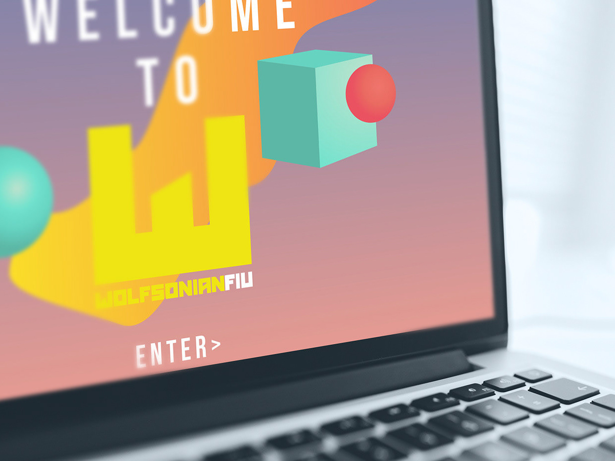

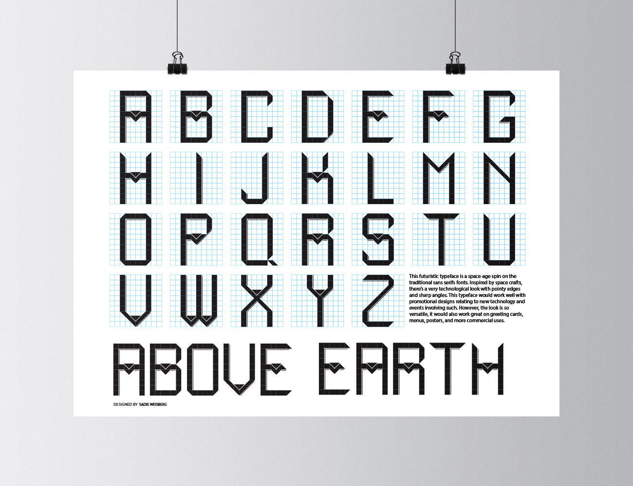
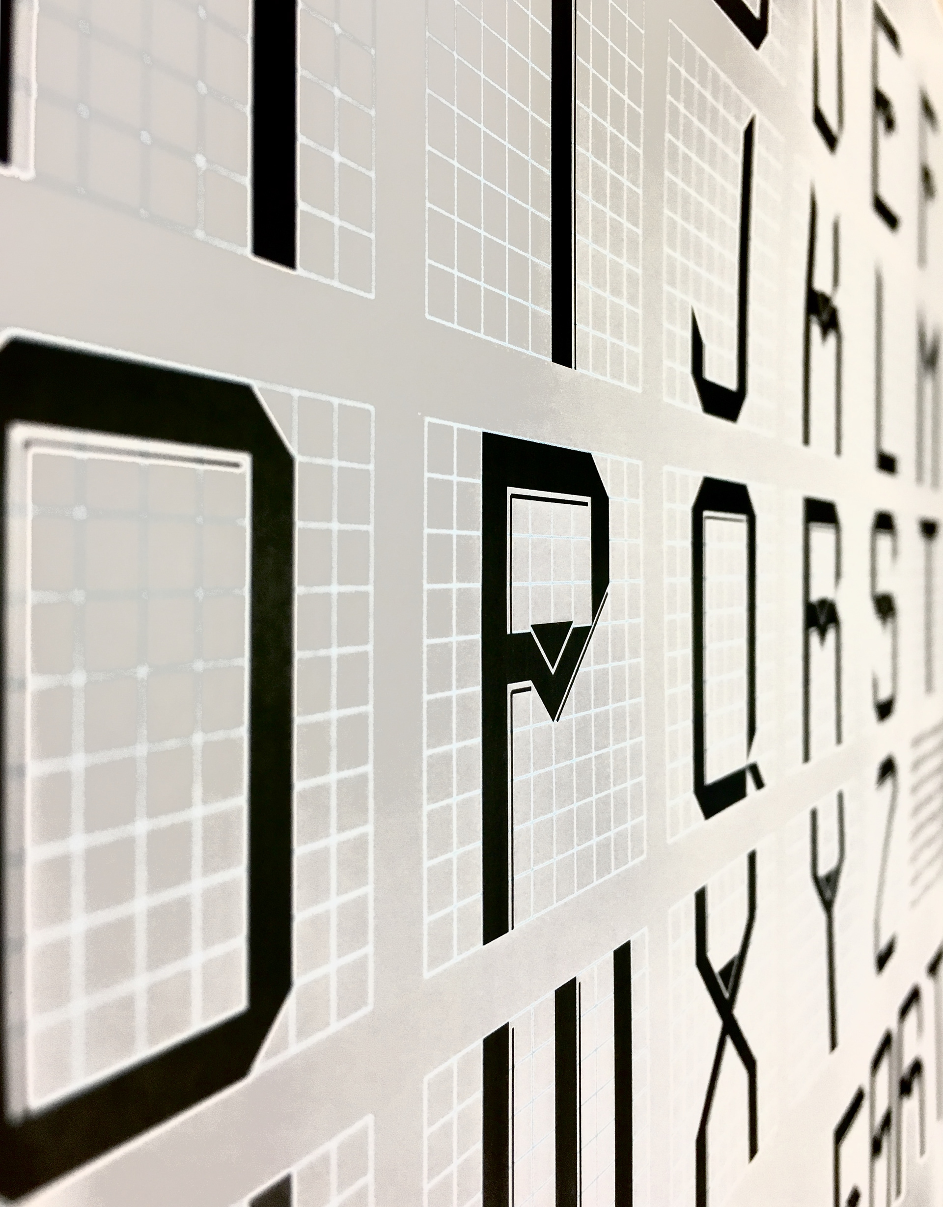
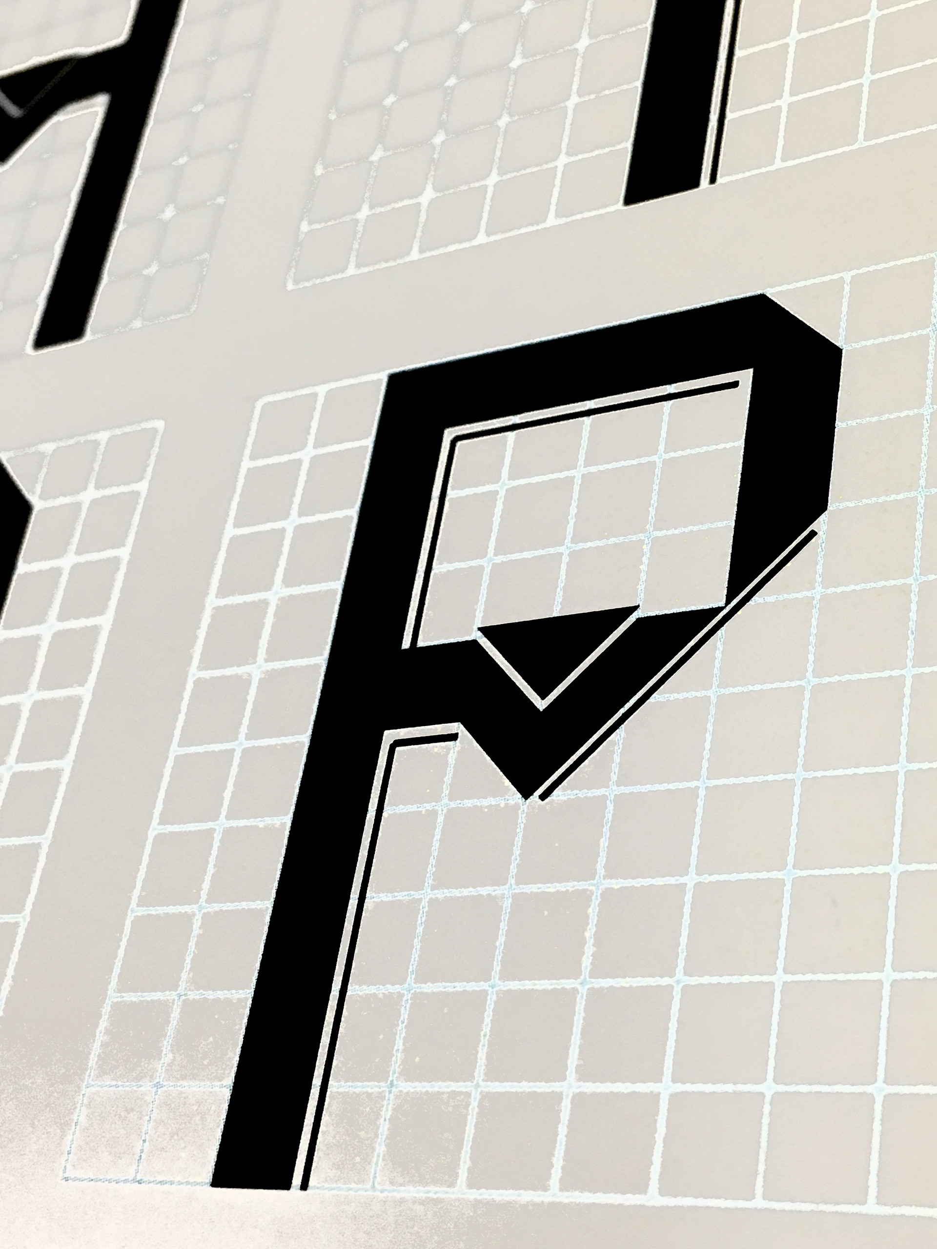

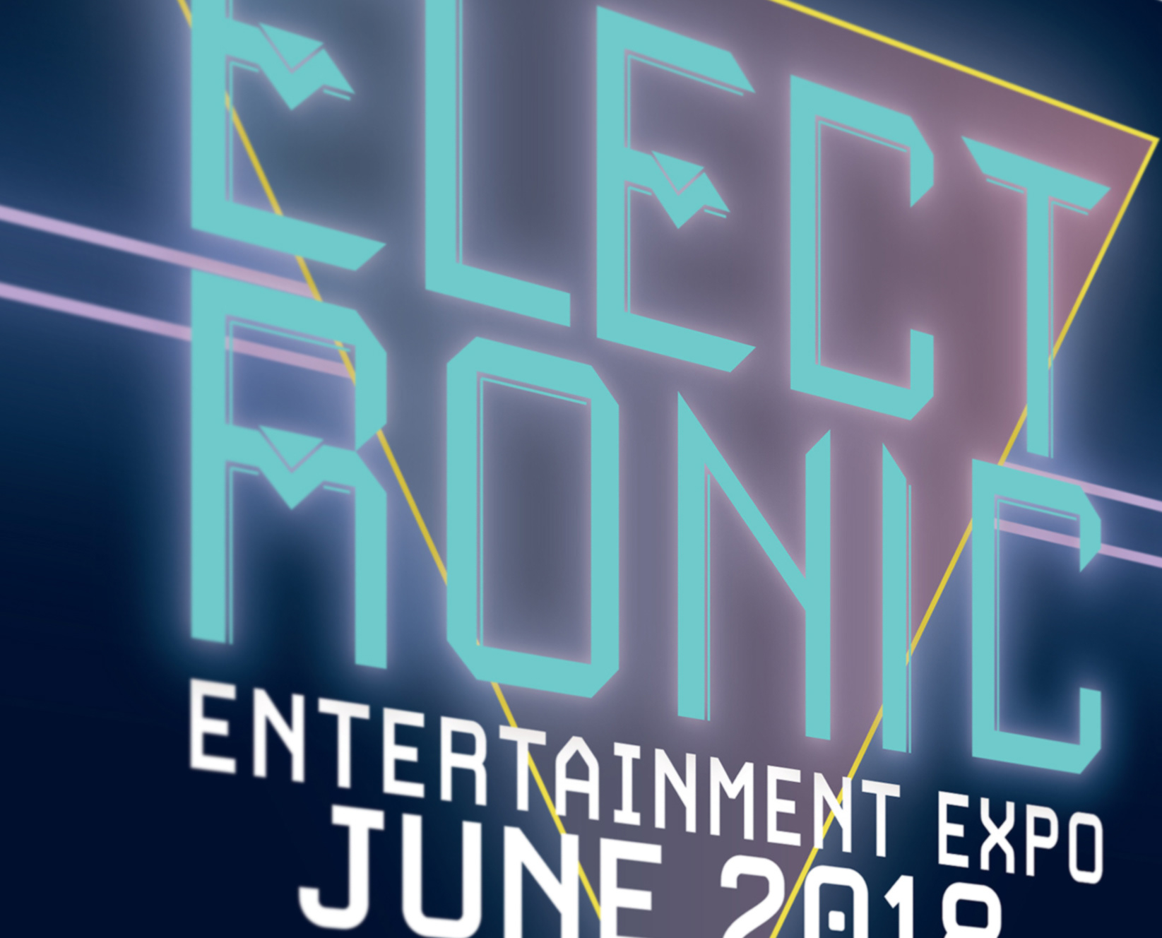
This futuristic typeface is a space-age spin on the traditional sans serif fonts. Inspired by space crafts and 1950s retro fonts, there's a very technological look with pointy edges and sharp angles. Working with the metal aspect of outer-space exploration, it has a rigid and cubic look. This style makes you want to look to the future.
This typeface would work well with promotion designs relating to new technology and events involving such. However, the look is so versatile, it would also work great on greeting cards, menus, posters, and more commercial uses.
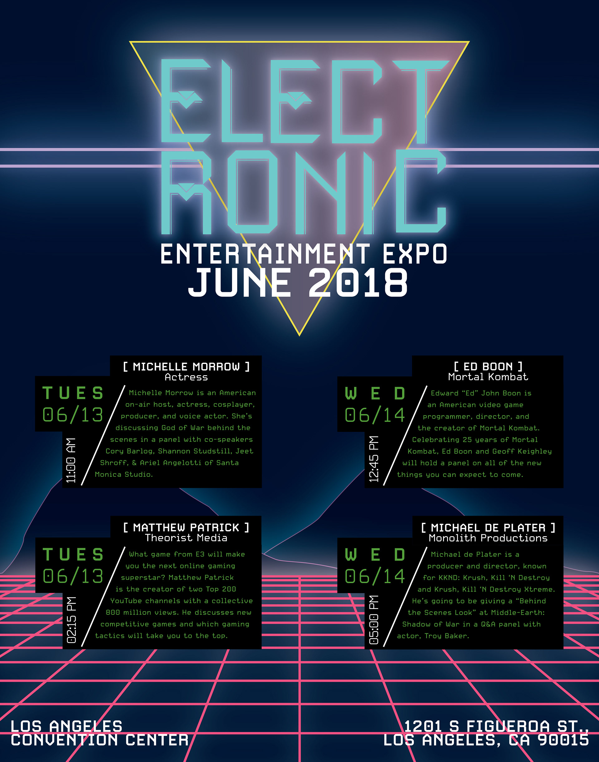

The goal for the project presented was to create a poster for an event that conveys what the event is about and is visually appealing for the viewers. This project allows one to create a sort of branding for a company or event and put information out there efficiently and effectively. The client is Electronic Entertainment Expo, which is known as “E3”. E3 is a huge two-day video gaming and electronics convention that presents new games and technology to the masses. They specifically focus on fun technology and events that are focused more around millennial age groups. They should have a fun and inviting poster that really shows what you might find inside.
The poster presented here is an ode to old video games of the 1980s. The grid particularly is reminiscent of the old Tron game. All of the glowing parts are based around that central theme of video games. Not only video games, however, but the text boxes for events are set up like command boxes on the computer. They are more than video games, and that needed to be represented as well. The typefaces for body font is family of fonts called “Carbon” from TypeKit. This font was an eye-catcher because it was so structural and almost looked like an alarm clock interface. The original plan was for it to be a sans serif font indefinitely because that’s the kind of look that goes with a video game event. Serif fonts are a little bit too sophisticated and serious for something fun like that. The colors are bright and neon on a flat dark background, as if to be in an unknown space just like the games. It brings out the real feeling of a video game. The paper this is printed on is a glossy, heavy cardstock paper and it really intensifies the glow and the lines around the informational boxes. This completes the goals and objectives of this project because it represents a little bit of what someone could see at this event and it makes it pretty clear it has to do with technology. It also brings a sense of fun and excitement to it and could really make the viewers excited to find out more about what’s going on at this event.