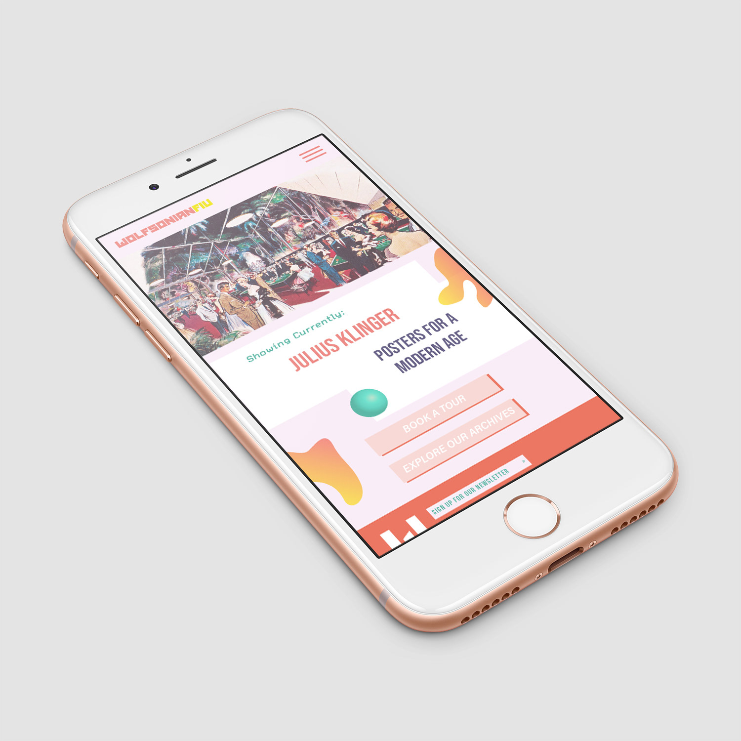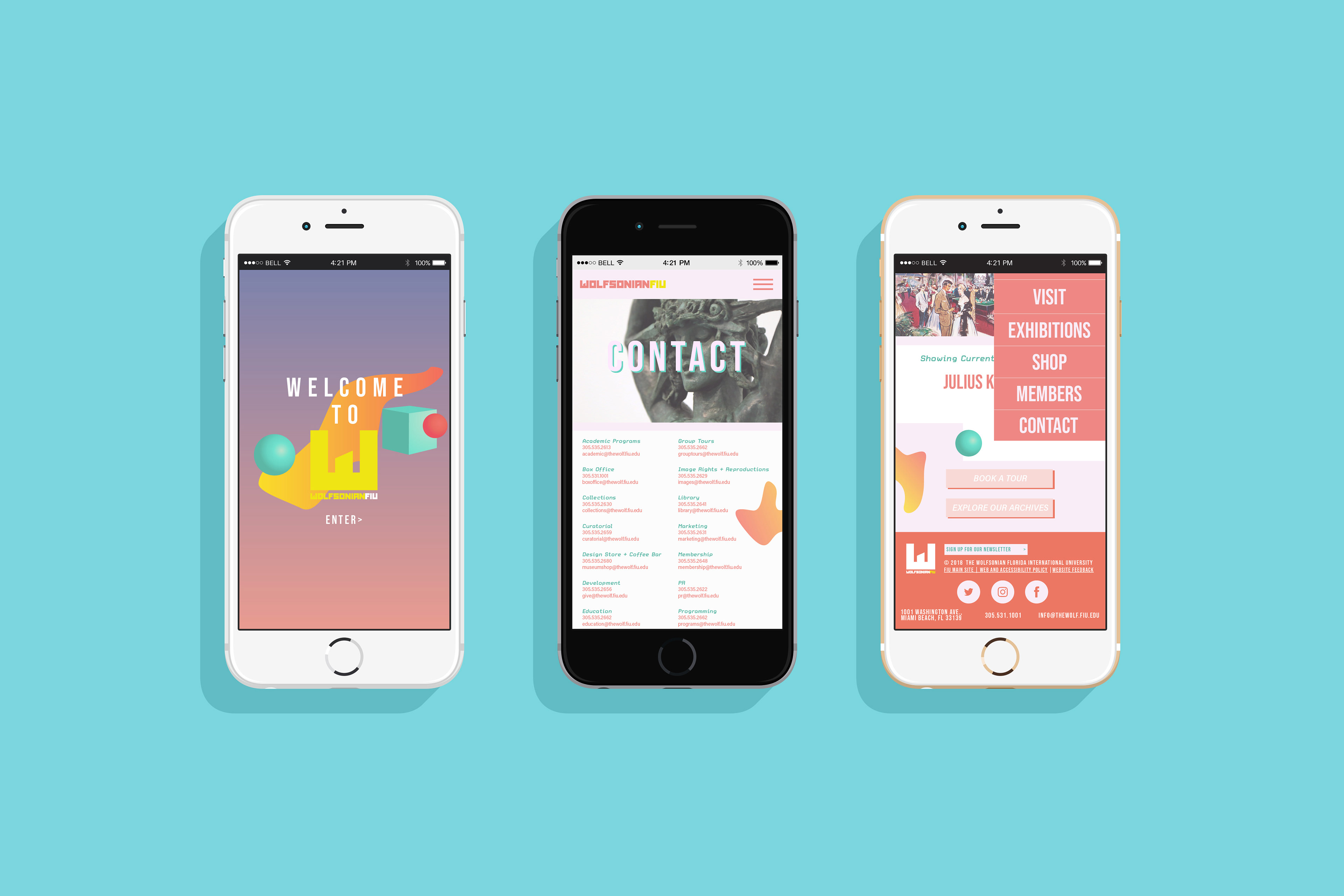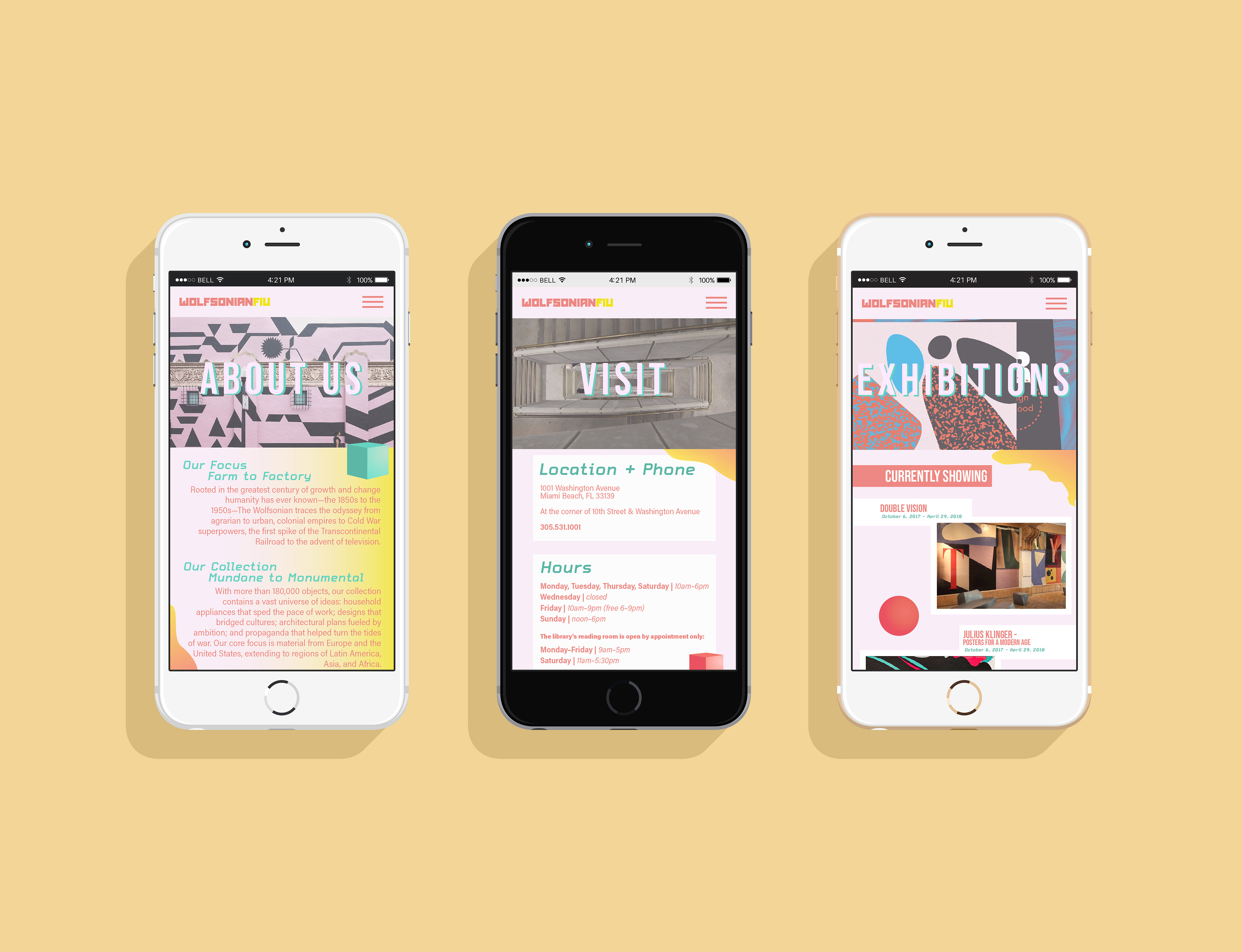
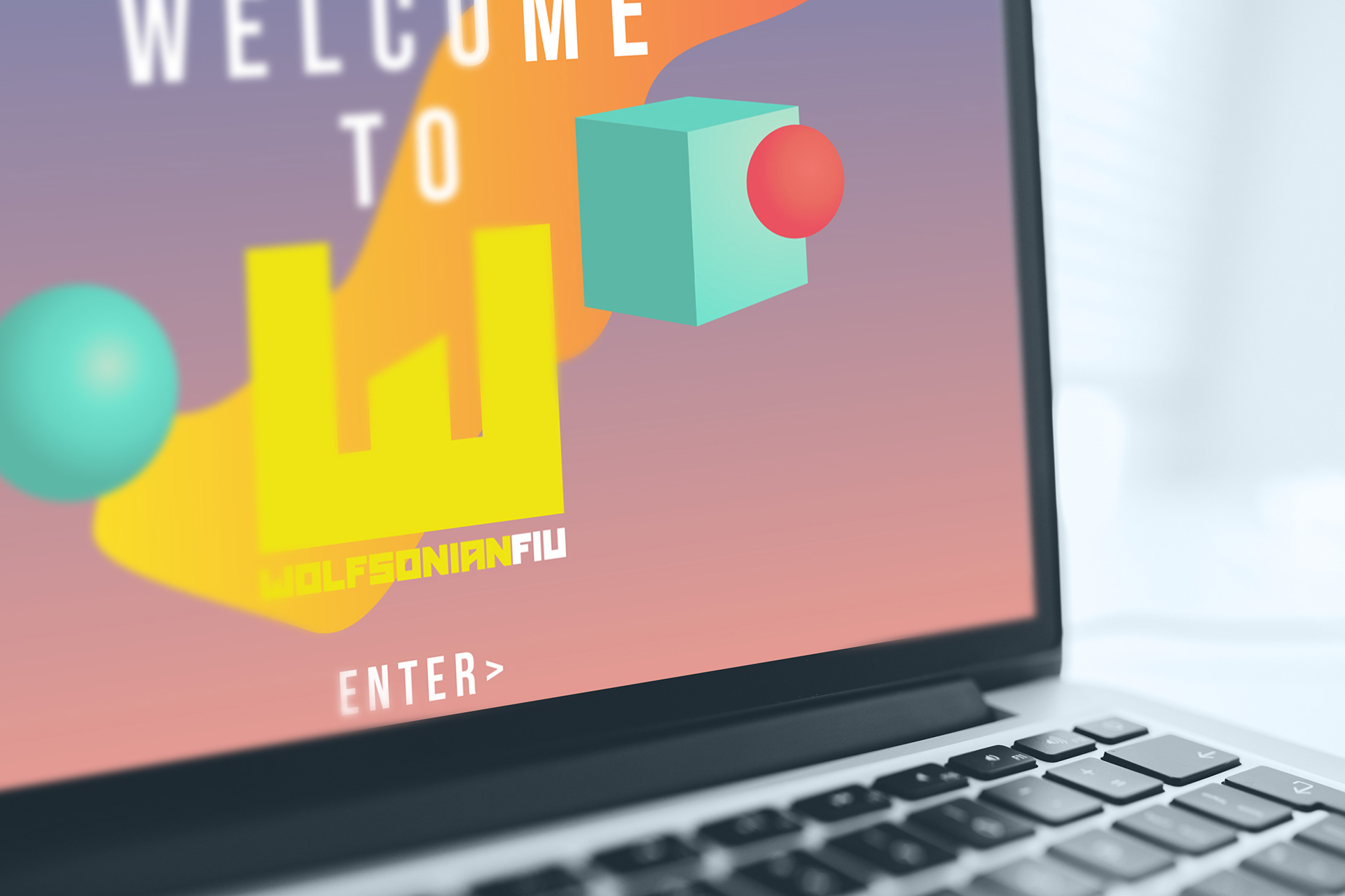
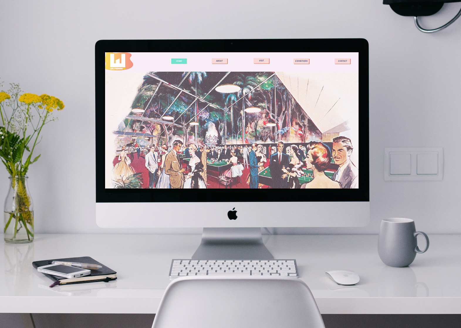
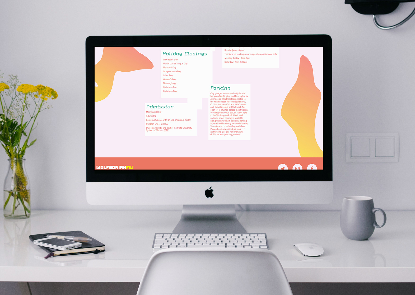
The concept for this brand was to show the graphic design aspect of the museum. The museum itself is full of design, but the website didn't show that. Since it's part of a university, I figured it was only best to make a design that drew in more students and young people. They have a lot of competition in Miami, so the best way to stand out is to show how fun they really are.
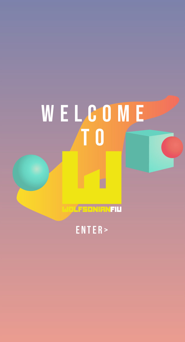
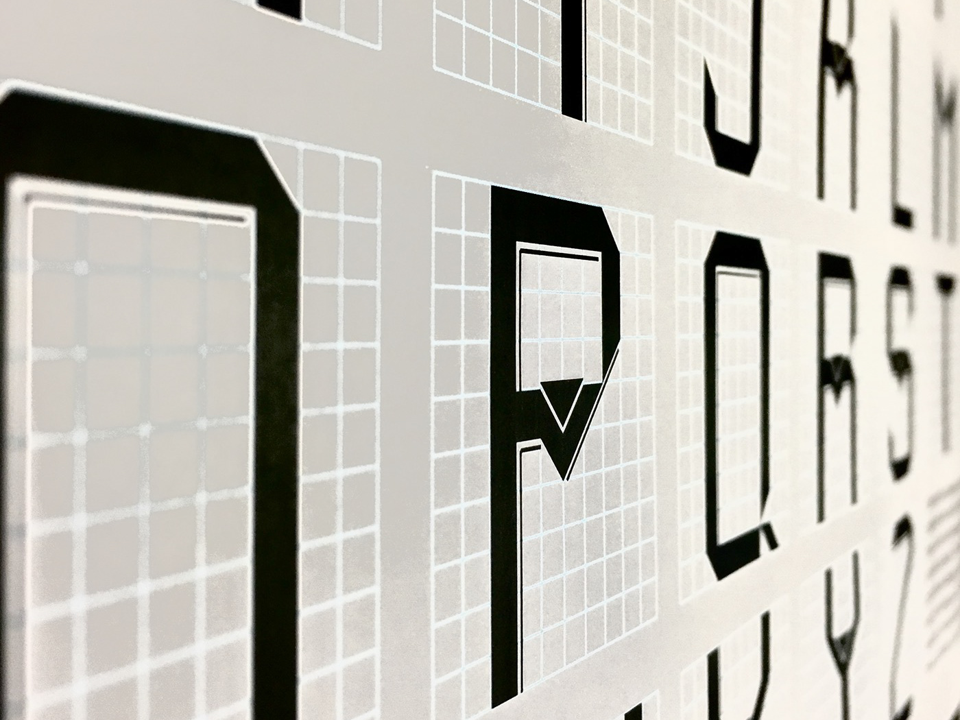
The fonts I used were Acumin Pro, Carbon, and Bebas Neue. I chose these fonts specifically because they were very modern and sleek sans serif fonts that matched the overall design. Acumin was a good type choice for body copy and in buttons. I used various versions of the font: italic, bold italic, regular. Carbon is a monospaced type and it gives off the feeling of new technology, progress, and modern design. I felt it complimented the other two fonts well as something a little different. Bebas Neue was great as a big header font, but also worked really well for the footer text in a smaller weight. It is all caps and contrasts the lower case fonts well.
I used the design elements that I used to add dimension. I used the spheres and cubes to make the web page appear as 3D in some places, further giving a nod to modern technology and design. I chose the bright colors to stand out from the light background. Their original site background was black, but I felt like their museum concept was quite the opposite. I added a gradient to he fluid shapes to add something a little different to stand out and feel fun. The overall design style that influenced this design would be modern mixed with Swiss design style in the way I used bright colors and set up the page.